
Around 2016 we began to work in Equilibrium and Perfect Balance. We developed the new branding and on/off line strategy for the brand (here you can see our case study for them) and then we started to build their shop online for the mats division. In those days, selling yoga stuff was not the most usual thing to do over the internet. 4 years after this, selling mats in a different way has become a must.
Early 2020. The team is going to get the ball rolling. All the work will start doing to ourselves this first question: how do we buy mats in internet? Besides pandemias and other fortuitous reasons and after several months analysing different consumer behaviors, the answer was clear: not everyone knows what is going to buy.
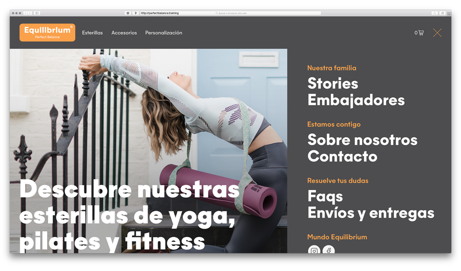
We divided the contents of the site in two main rooms: one for the shop, another for the narrative. One on the main header, the other on the right-burger menu. One ready to explain what you have to buy in order to your needs; the other dedicated to all the brand storytelling. One rational. The other, emotional.
We divided the contents of the site in two main rooms: one for the shop, another for the narrative. One on the main header, the other on the right-burger menu. One ready to explain what you have to buy in order to your needs; the other dedicated to all the brand storytelling. One rational. The other, emotional.
Following this first approach, all the rest would come together, sooner rather than later. As it was.
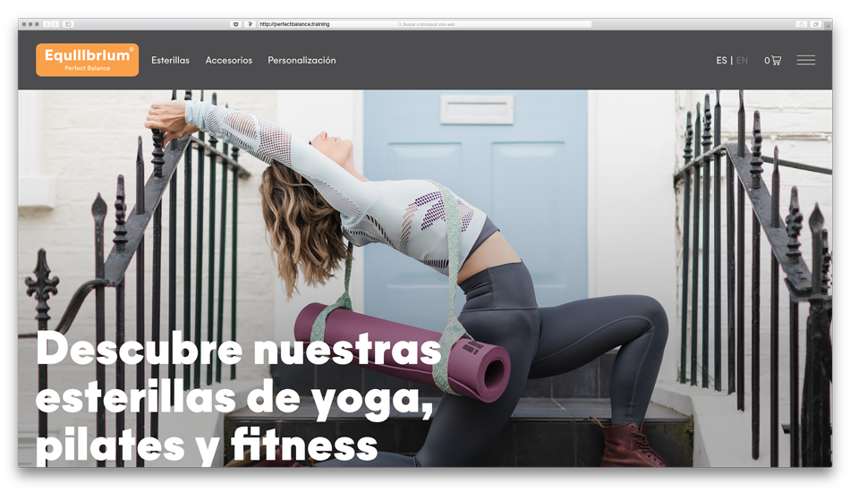
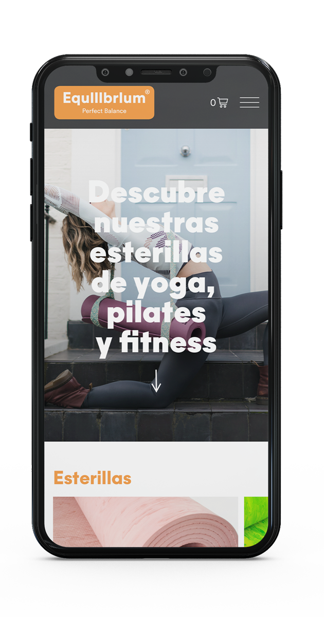
An easy online shop for a beautiful project, making clear every click and all the user journey through the website. The Home as a big and long showcase, showing almost all the sections you can find on the site menus. Big pictures, big typography and stunning colours.
An easy online shop for a beautiful project, making clear every click and all the user journey through the website. The Home as a big and long showcase, showing almost all the sections you can find on the site menus. Big pictures, big typography and stunning colours.
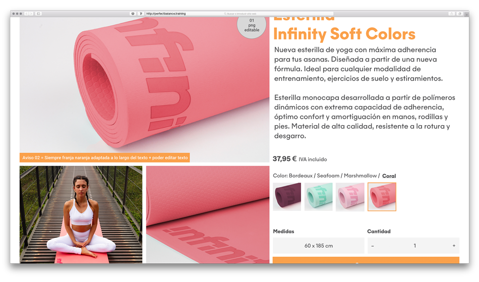
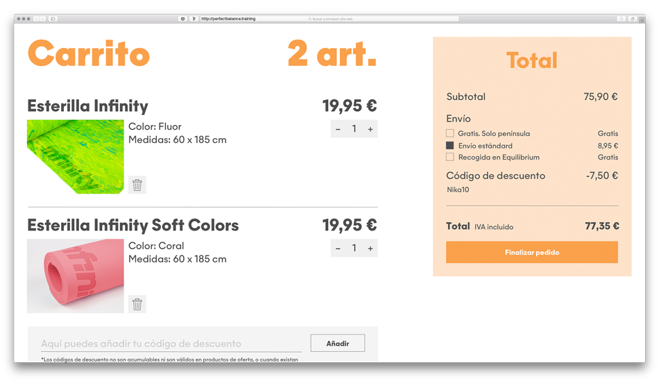
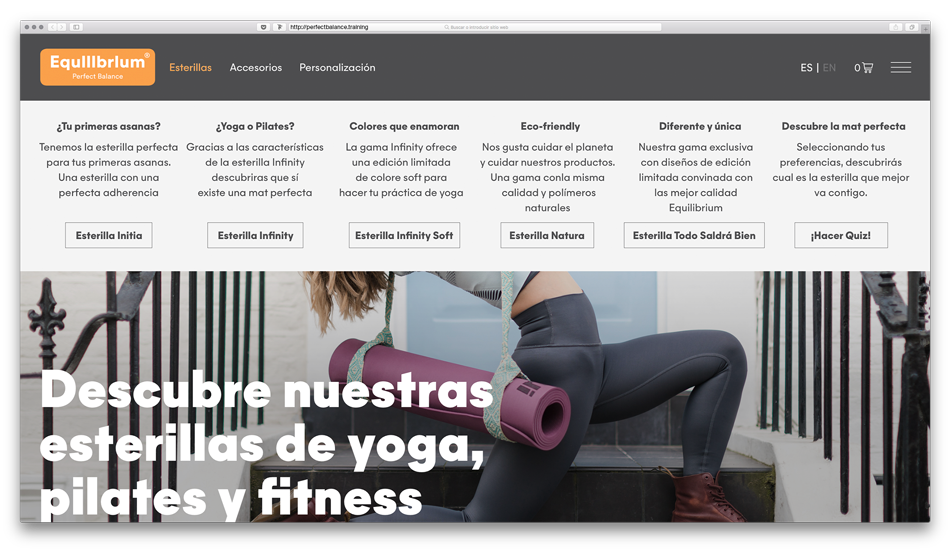
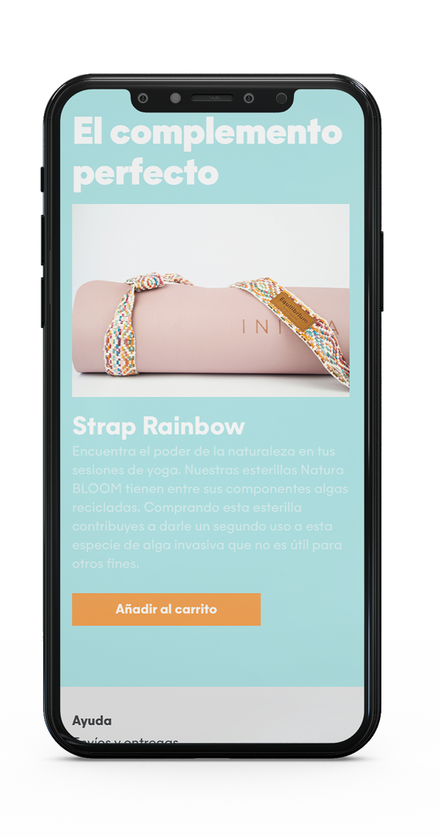
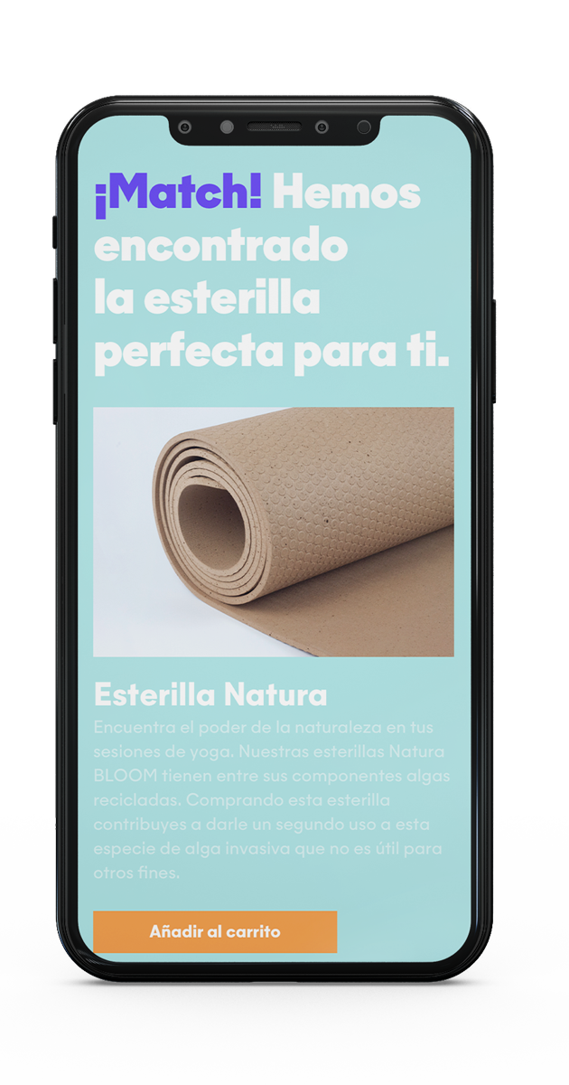
And easy almost one-click ordering to make easier the buying experience. And, as you can see on the below screenshot, a Quiz to advice which of our products is the best for you.


«One ready to explain what you have to buy in order to your needs; the other dedicated to all the brand storytelling.»
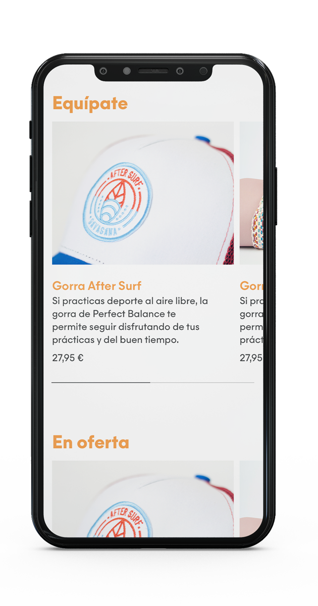
And of course, an editorial platform where to develop all the brand storytelling. The Stories section. Where the things happen. Where you can realize you can be a yogi too.
Regarding typefaces, we decided to work only with Majorant by Eduardo Manso as this is a clear and modern geometric-humanistic font that works pretty well in big sizes. Its shape perfect fits with our aim to reach the eye users in the digital platform; and its wide range of weights allows us to work only with one typeface for the whole site which is a must today.
