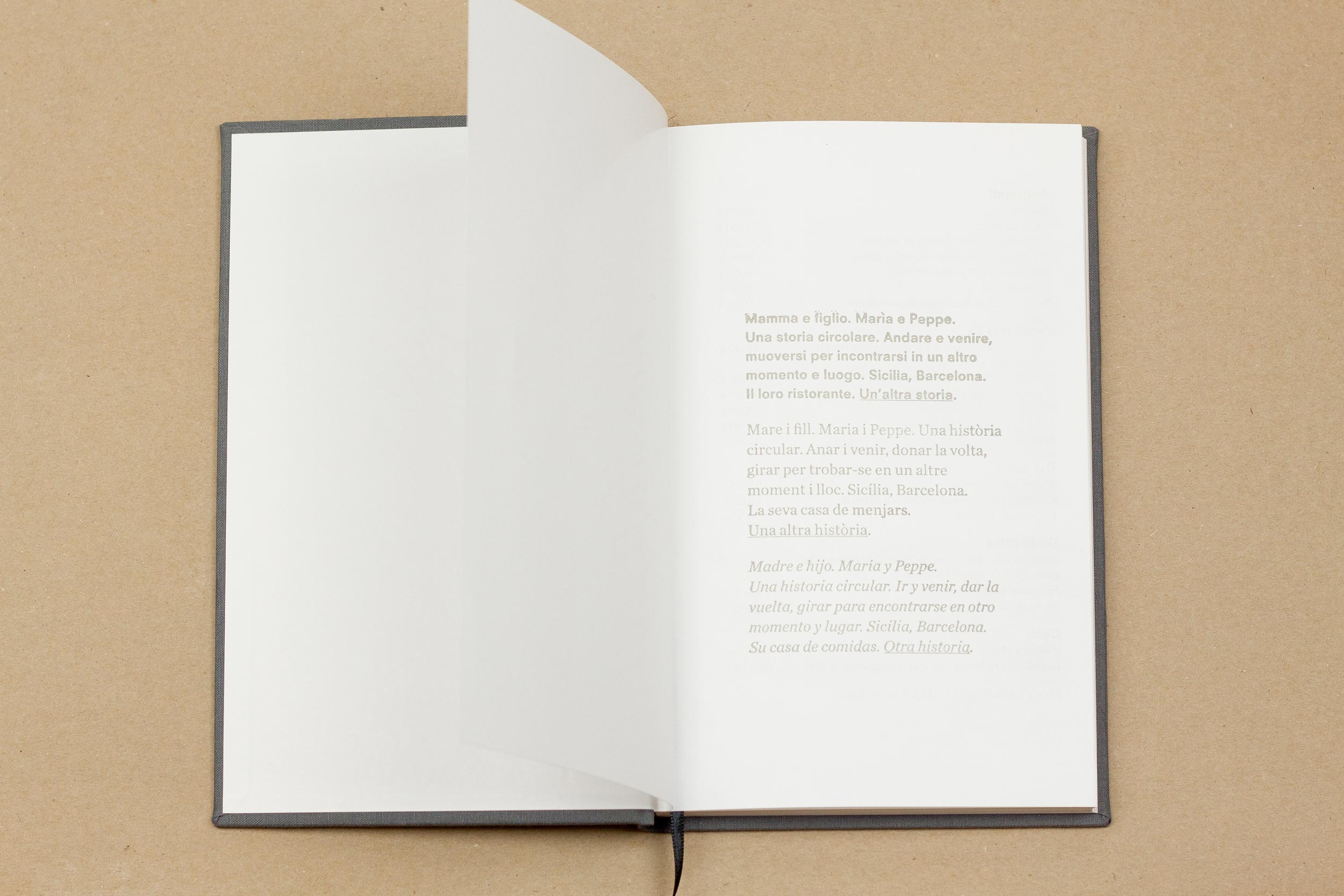
Un’Altra Storia
This is a project that we took as a personal project. An exploration deep inside the intimacy of a family, a Sicilian family, to find the beauty of a way of life: quietness, purity and flavor. A restaurant in Barcelona that can speak by itself as a perfect circle.

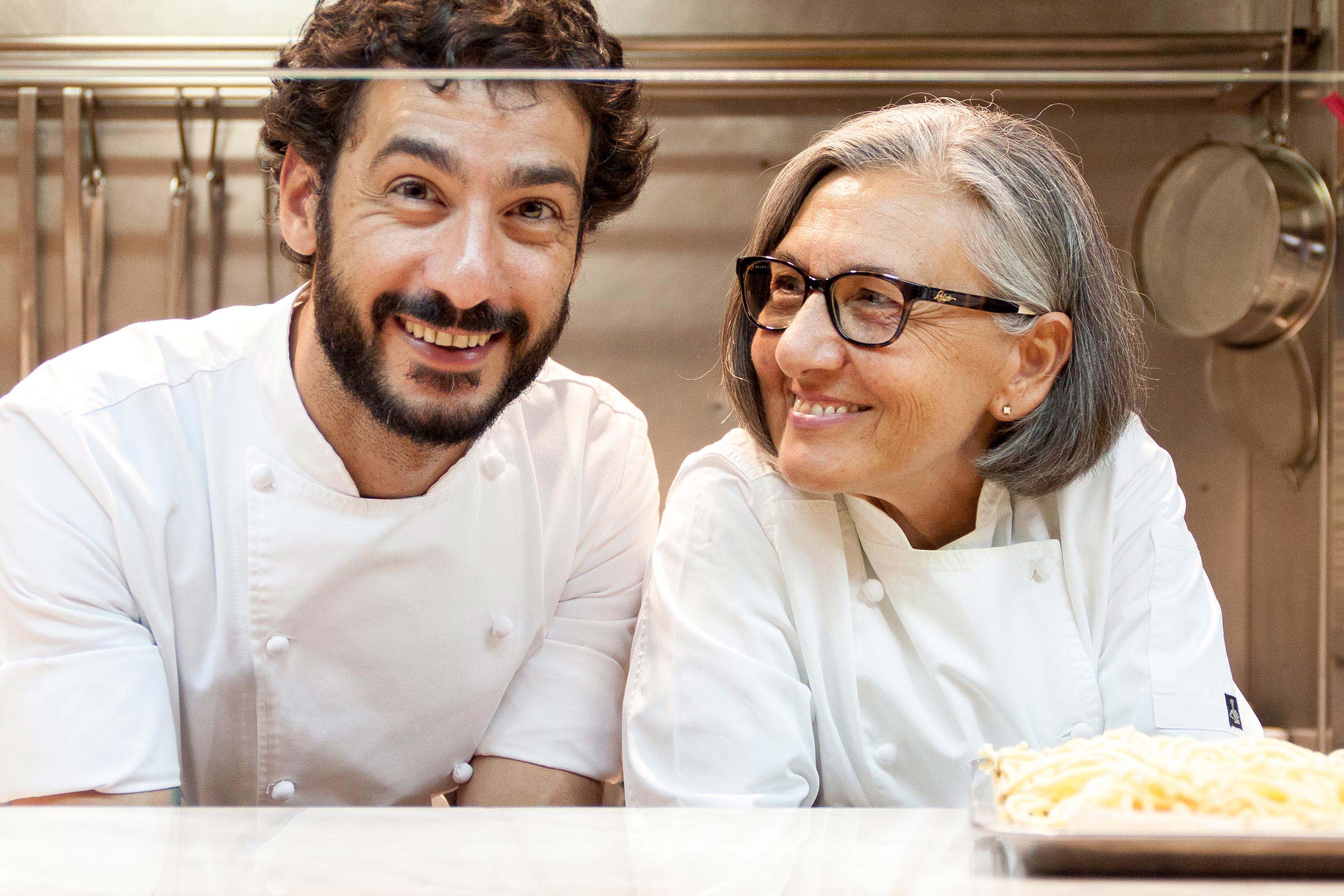
All started some time ago. Once she retired as chef and closed her own Sicilian Restaurant Z’alia in San Giuseppe Jato near Palermo, Maria Brusca decided to come to Barcelona to open a new restaurant with her son, Peppe Palo. It was a kind of back to the past, as he started to learn cooking in that Sicilian restaurant when he was fifteen. After a bunch of years, they have opened this new adventure that Pino catalogued as “Another Story”; read in Sicilian is “Un’Altra Storia”, pretty similar to what we said in Catalán, “Una Altra Historia”.

Once the naming was clear, we started to think about where the stories are placed. Obviously, in the books. Then, we thought this new story, this ‘another story’ had to be written in a book. But, what story does make a restaurant? This was pretty obvious as well: the menu. We went to visit a pair of old bookshops to find some old Italian books, disassemble them and make new books combining blank pages with those pages extracted from the old books. Once we had those “new” books, the last part consisted in making some super-stamps in the Vostok Printing Shop with the current menu. This is the part we like the most; every time Maria and Peppe are changing the menu, we have to print a new stamp, take the books, look for a blank page on them and stamp the new menu that, years after years will write the authentic new “Another Story”; the history of the restaurant, The history and story of them.

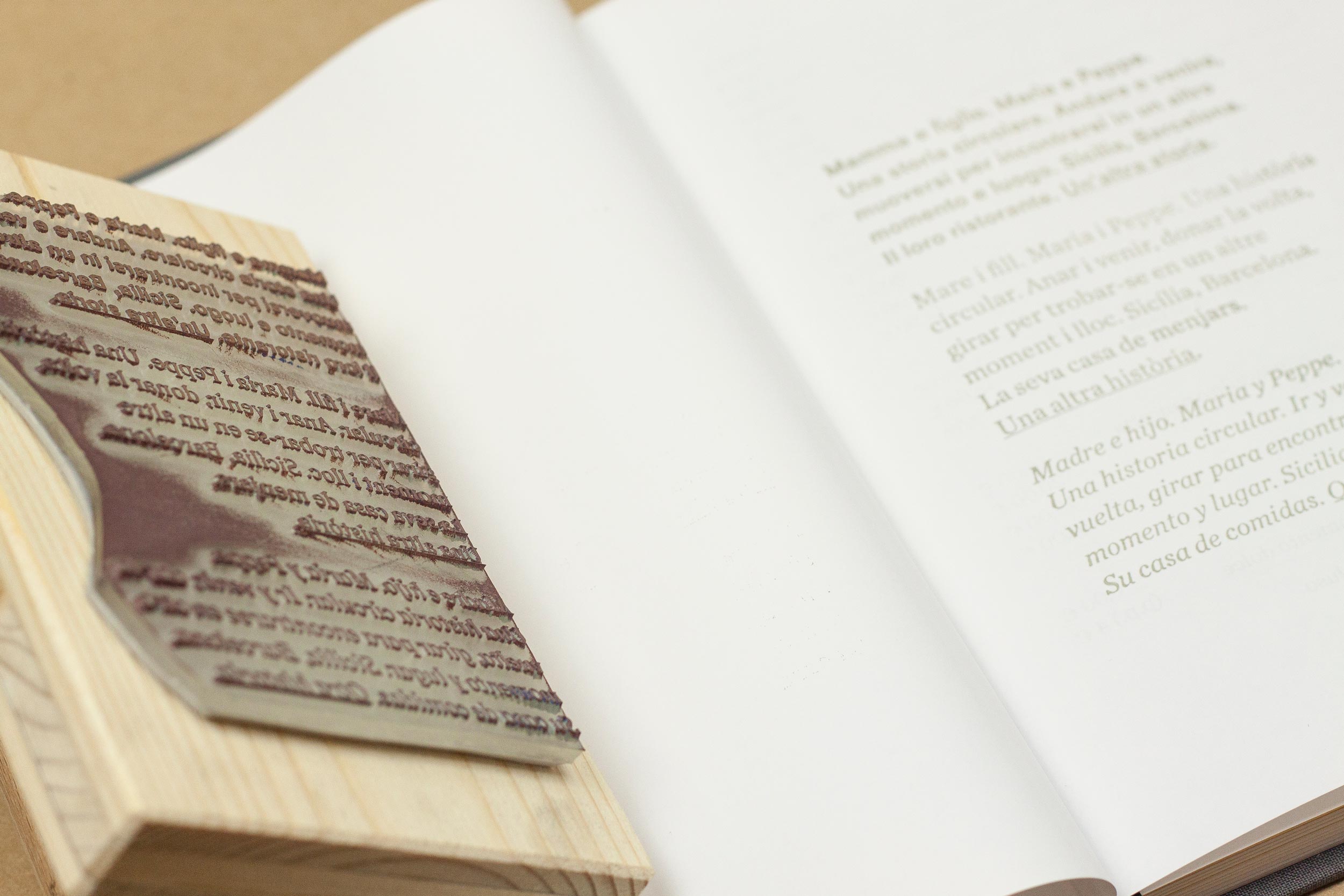

«(…) every time Maria and Peppe are changing the menu, we have to print a new stamp, take the books, look for a blank page on them and stamp the new menu that, years after years will write the authentic new “Another Story”; the history of the restaurant, The History and Story of them.»


Why did we choose Neuzeit S and Chronicle?
The first one was a pretty personal election: we wanted a neutral, kind-of geometric-humanistic font that had a contemporary character but not too trendy. Then we found the Siemens corporate typeface that recalled us to Circular by Lineto. And it was absolutely working for us.
About Chronicle Text G1, printing stamps was a mandatory, and small sizes were going to be recurrent. We had to think in a typeface ready for be printed in hard conditions and easy to be read in small sizes. In addition, we needed this typeface to be hight contrasted between weights so we could use only two of them (plus italics) and this would be enough to explain whatever is necessary in a daily menu. Let’s say, we need a 4×4 typeface. And we found it.