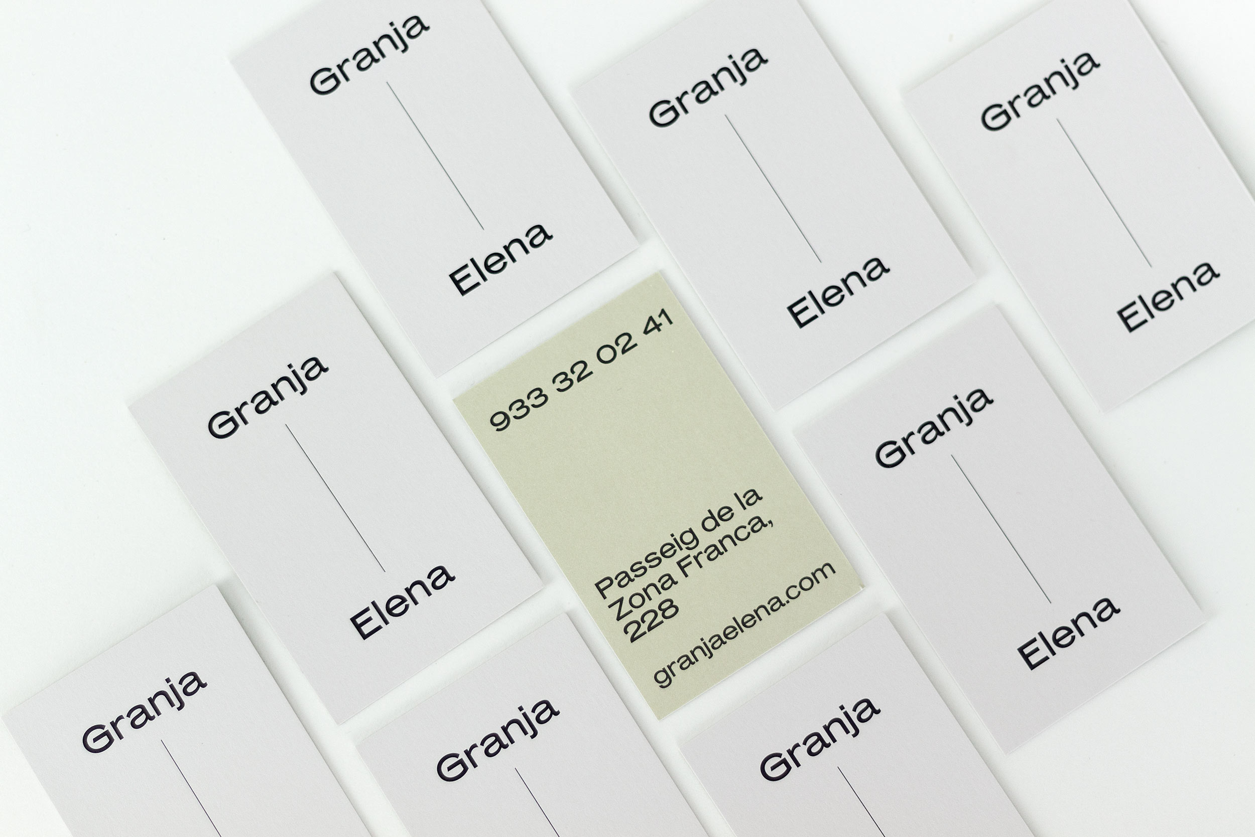
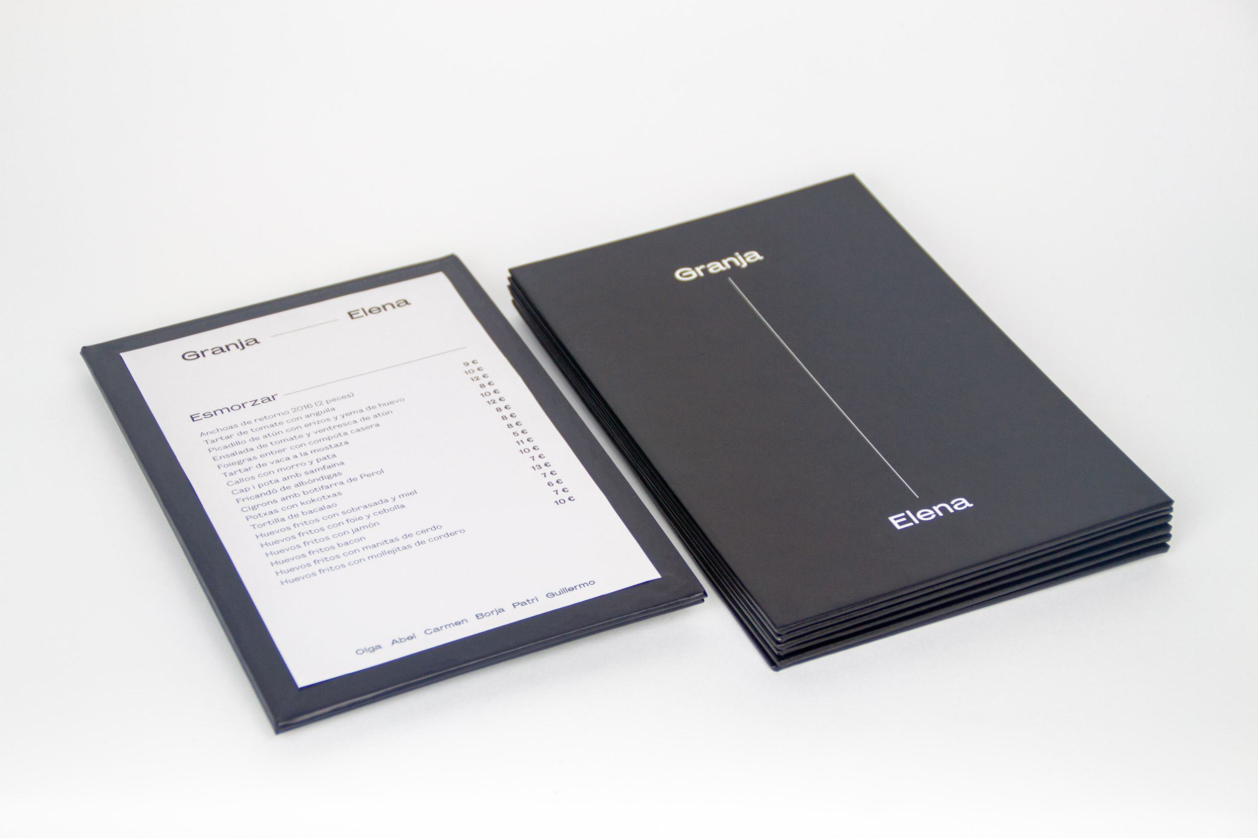
Granja Elena
We developed the new identity for Granja Elena that was revealed together with the refurbished restaurant. Conceptualizing time without words, not saying “since 1974”, not saying anything, just a timeline. Formalizing that everything that is between those words, on that line, is what has made Granja Elena one of the best restaurants in Barcelona.
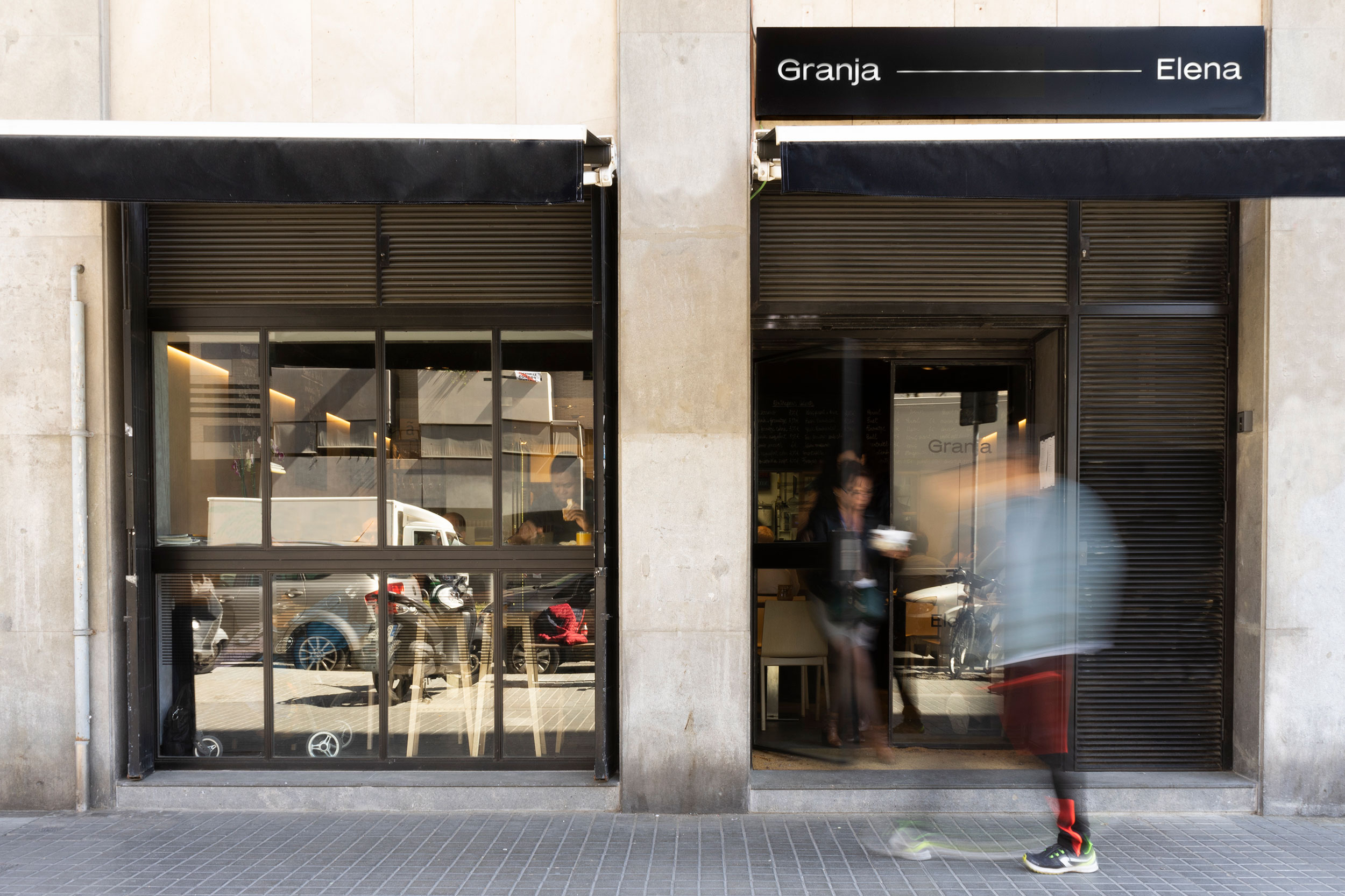
«What about Mars Extended? Just by looking at it we were convinced that this “a” had to be in the identity. Plus, the extended width helps Granja Elena to express and formalize the timeline they wanted to draw without drawing. A fine line combined with an extended typeface were a must.»
Founders Grotesk Text is probably one of our favorite contemporary typefaces when readability is crucial. We mean it, we didn’t find something like it that makes reading such a great pleasure. And taking into account the menu of the restaurant and the in-house printing that the staff will have to do due to the diary and continuous updates of the plates, we are pretty sure it was a perfect choice.


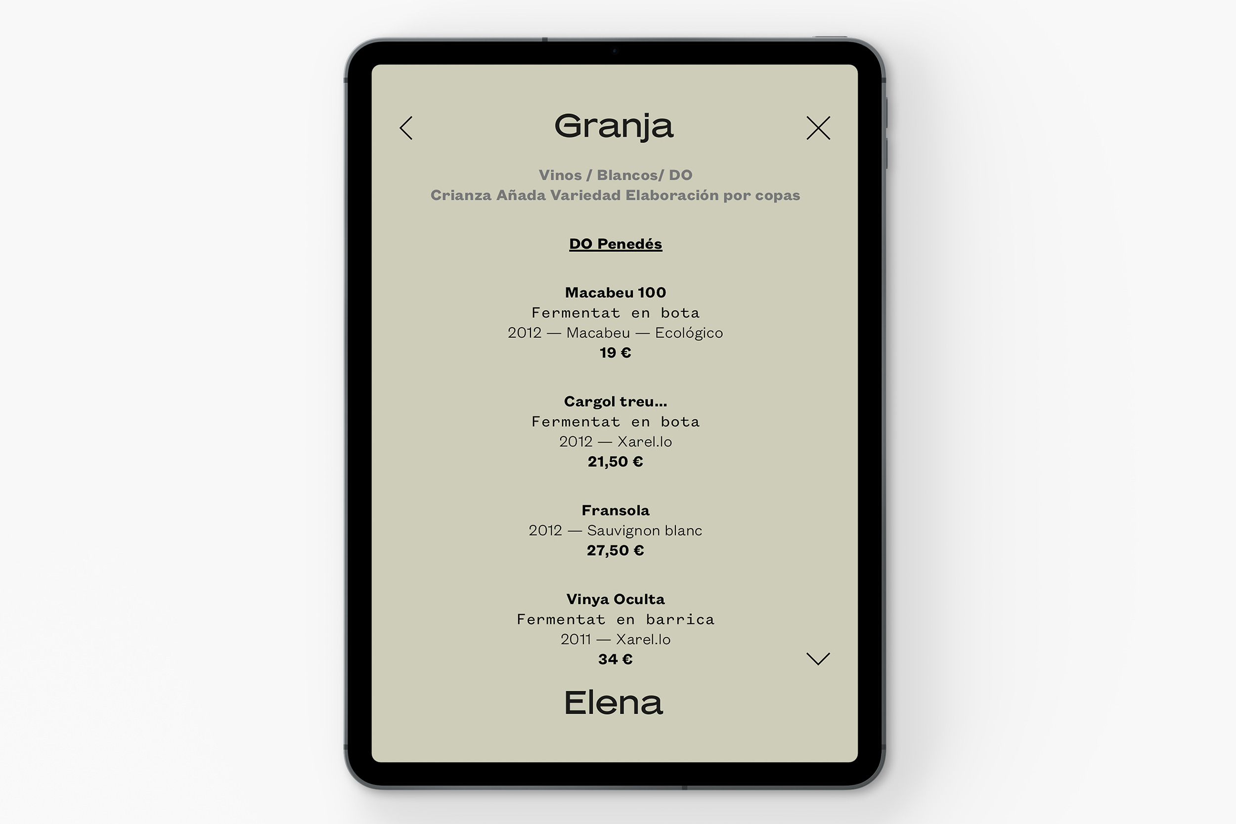
And due to the huge extension of the wine menu, we had to develope an app to be played on their Android tablets to show the almost 5.000 wine references they have. It was easy to apply the identity to a digital layer as the line and the extended font are really flexible; another story was to introduce the reference in the data base we create to find every wine under 7 different categories (type of grape, wine regions, cellar, etc).